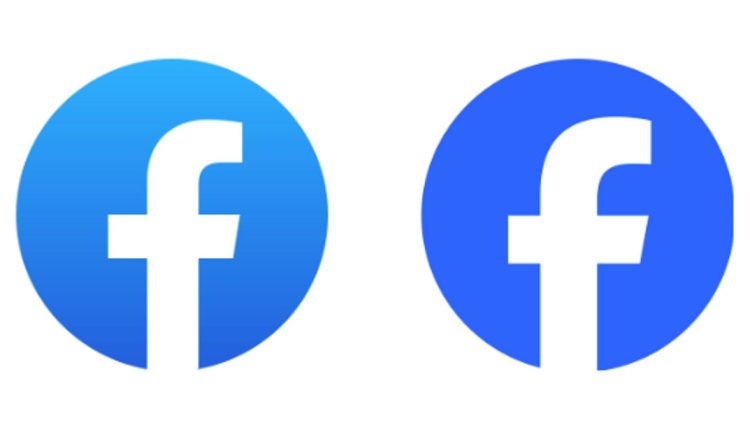
Facebook Logo Update: Social Media Giant’s Latest Refresh
A Closer Look at Facebook's Subtle Logo Redesign and Brand Refresh

Facebook, the world’s leading social media giant, has discreetly introduced some noteworthy updates to its logo and reaction emojis. At a casual glance, these alterations may not immediately catch your eye, but they signify a commitment to enhancing the experience for Facebook’s vast user base, which currently stands at a staggering 2 billion daily users. Unlike previous logo changes, this latest iteration focuses on subtle refinements rather than a complete overhaul.
The most apparent modification is to the logo itself. While the core design remains familiar, the blue hue has been subtly deepened, and the letter ‘f’ has undergone a slight repositioning for an overall refreshed look.
Not stopping at the logo, Facebook has also revamped its wordmark, incorporating the Facebook Sans typeface and adopting a more prominent blue and white color palette.
Inside the platform, even the reaction emojis have received subtle adjustments, giving them a slightly different appearance. Presently, these changes are visible in the desktop version of Facebook, with plans to gradually introduce them to the app. Furthermore, Facebook has tantalizingly hinted at more significant updates for the app in the pipeline, where these enhancements will be rolled out gradually to its users in the coming months.
